【neumorphism】CSS实现新拟态设计风格计算器
页面显示效果, 请直接访问下面链接
最近在社区看到一种设计风格——新拟态,国外用neumorphism这个词表示,关于这种风格的介绍,可以看下面的链接
使用CSS模拟:
GITHUB上的一个DEMO
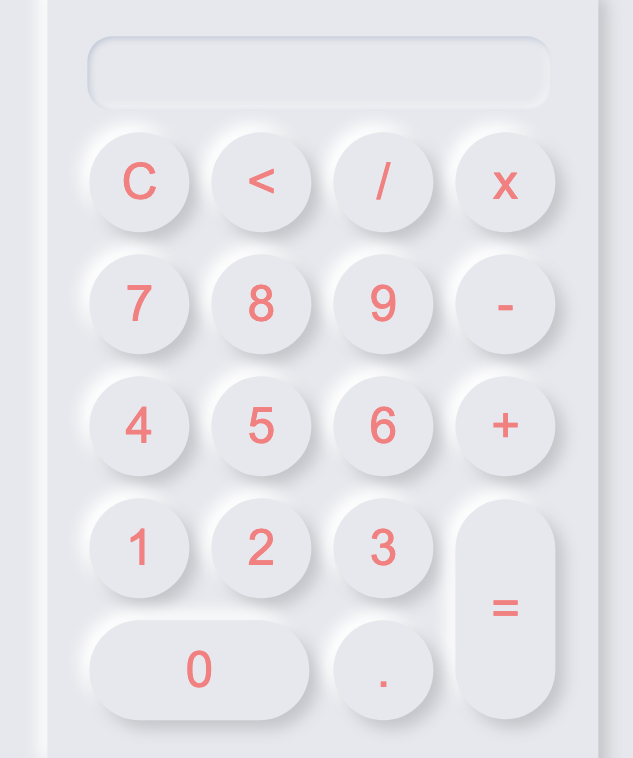
为了方便演示我将颜色以及大小调节了一下:
今天群里老哥推荐了一个直接生成CSS的网站,非常方便 neumorphism
核心代码:
box-shadow: 9px 9px 16px rgb(163, 177, 198, 0.6), -9px -9px 16px rgba(255, 255, 255, 0.5);修改后的style.css文件
* {
    margin: 0;
    padding: 0;
}

.button {
    width: 100px;
    height: 100px;
    font-size: 50px;
    margin: 10px;
    cursor: pointer;
    background: #e0e5ec;
    outline: none;
    box-shadow: 9px 9px 16px rgb(163, 177, 198, 0.6), -9px -9px 16px rgba(255, 255, 255, 0.5);
    border: none;
    border-radius: 50px;
    color: lightcoral;
}

.button:active {
    box-shadow: inset -2px -2px 6px rgb(163, 177, 198, 0.6), inset 2px 2px 6px rgba(0, 0, 0, 0.8);
}

.dl {
    width: 220px;
}

.ll {
    height: 220px;
}

.textview {
    width: 448px;
    margin: 10px;
    padding: 8px;
    font-size: 50px;
    padding: 10;
    border: none;
    border-radius: 25px;
    color: lightcoral;
    outline: none;
    background: #e0e5ec;
    box-shadow: inset 2px 2px 6px rgb(163, 177, 198, 0.6), inset -4px -5px 8px rgba(255, 255, 255, 0.5);
}

.main {
    width: 551.25px;
    height: 787.5px;
    position: absolute;
    top: 50%;
    left: 50%;
    transform: translate(-50%, -50%);
    background: #e0e5ec;
    border-radius: 15px;
    box-shadow: 9px 9px 16px rgb(163, 177, 198, 0.6), -9px -9px 16px rgba(255, 255, 255, 0.5);
}

.bandt {
    position: absolute;
    top: 50%;
    left: 50%;
    transform: translate(-50%, -50%);
}

.bg {
    background: #e0e5ec;
    height: 100vh;
}配色参考:GITHUB地址
标签: css neumorphism 新拟态
«上一篇:测试MarkDown
开发小程序的时候跳过域名验证:下一篇»


还没有任何评论,你来说两句吧